UI/UX Design Documentation
This document outlines how our FieldNotes AI app follows Nielsen Norman Group's 10 Usability Heuristics for User Interface Design. Each heuristic is explained with concrete examples from our app.
1. Visibility of System Status
What it means: Keep users informed about what's happening through timely feedback.
Examples in our app:
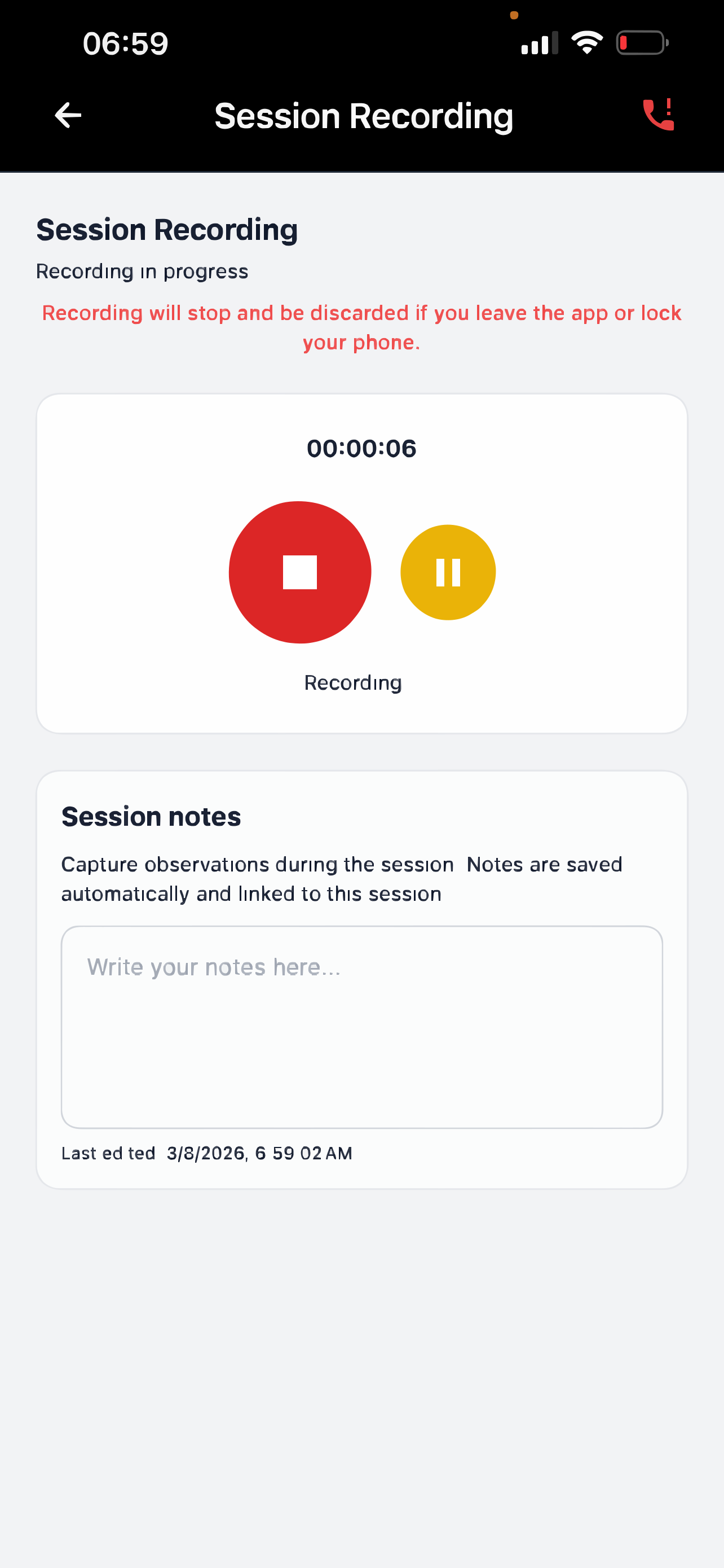
- Recording indicator - When practitioners record a session, a red recording indicator shows they're actively recording
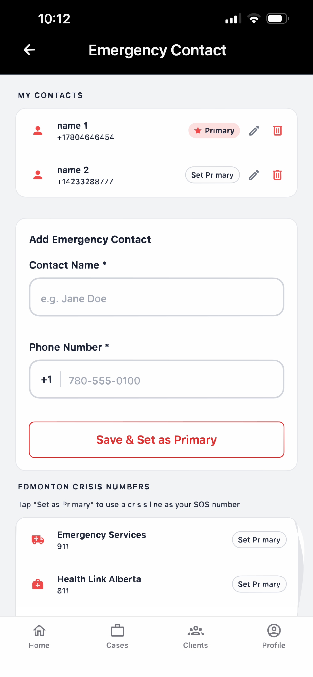
- Primary contact badge - Emergency SOS contacts show a "Primary" badge so users can instantly see which number is currently set as the main emergency contact
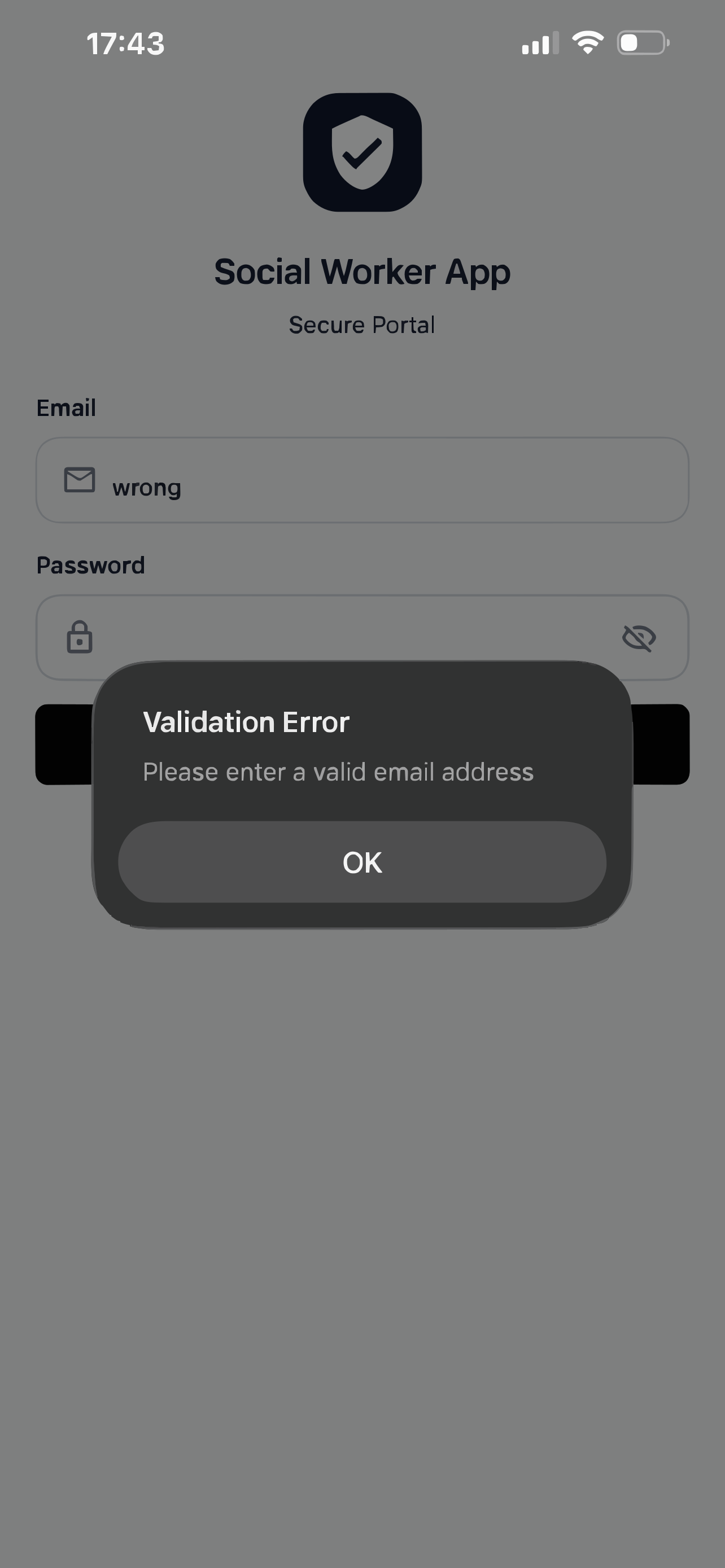
- Login feedback - When users enter incorrect credentials, they immediately see an error message explaining what went wrong
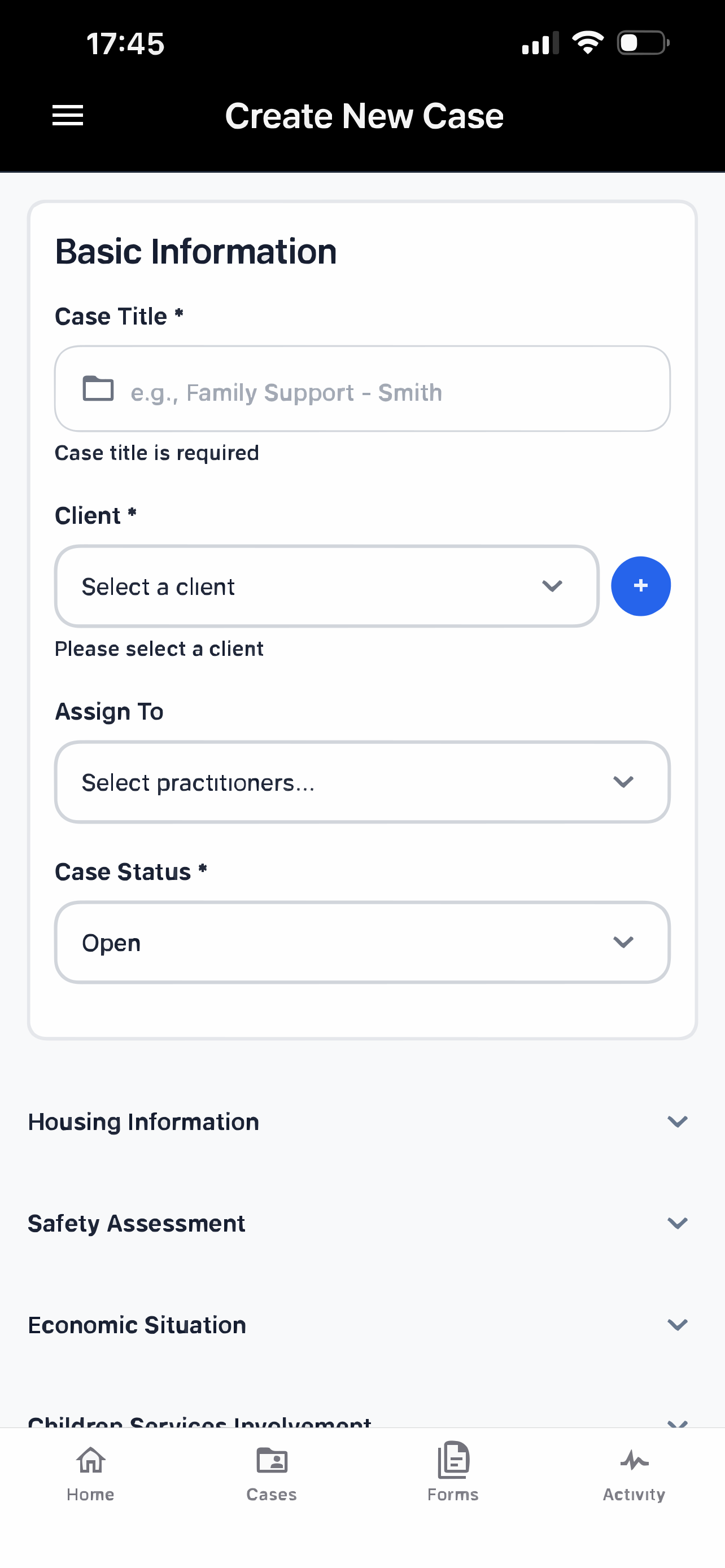
- Case creation progress - As admins fill out forms to create a new case, the app shows which fields are required and validates input in real-time
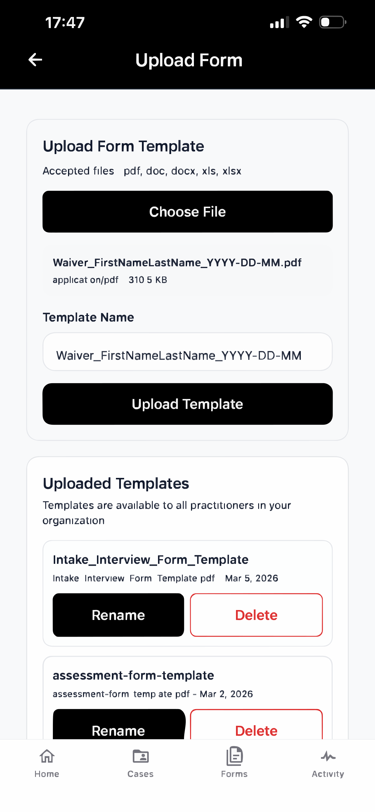
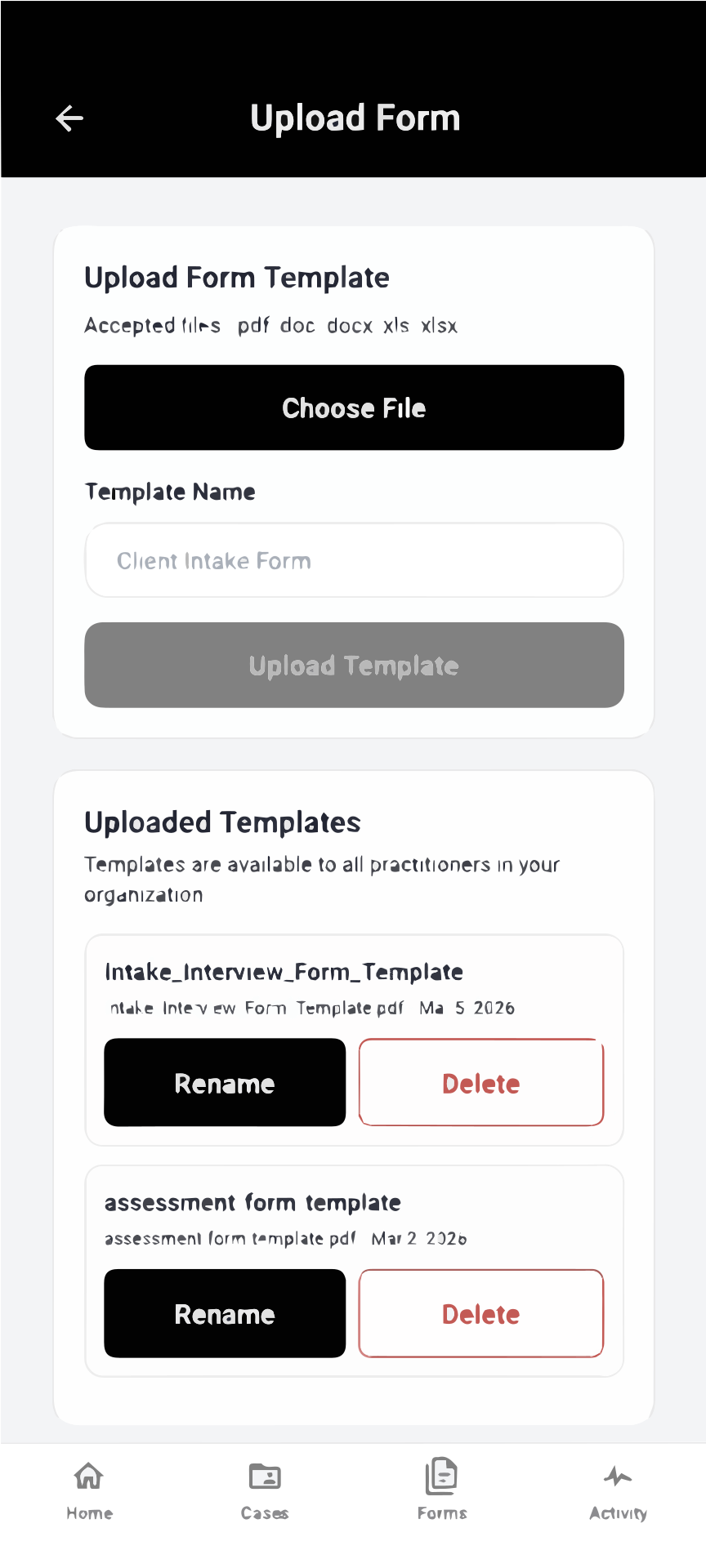
- Template upload feedback - When uploading form templates, users see the selected file name and size displayed immediately, can edit the template name, then see it appear in the uploaded templates list once complete
2. Match Between the System and the Real World
What it means: Use familiar words and concepts that users understand, not technical jargon.
Examples in our app:
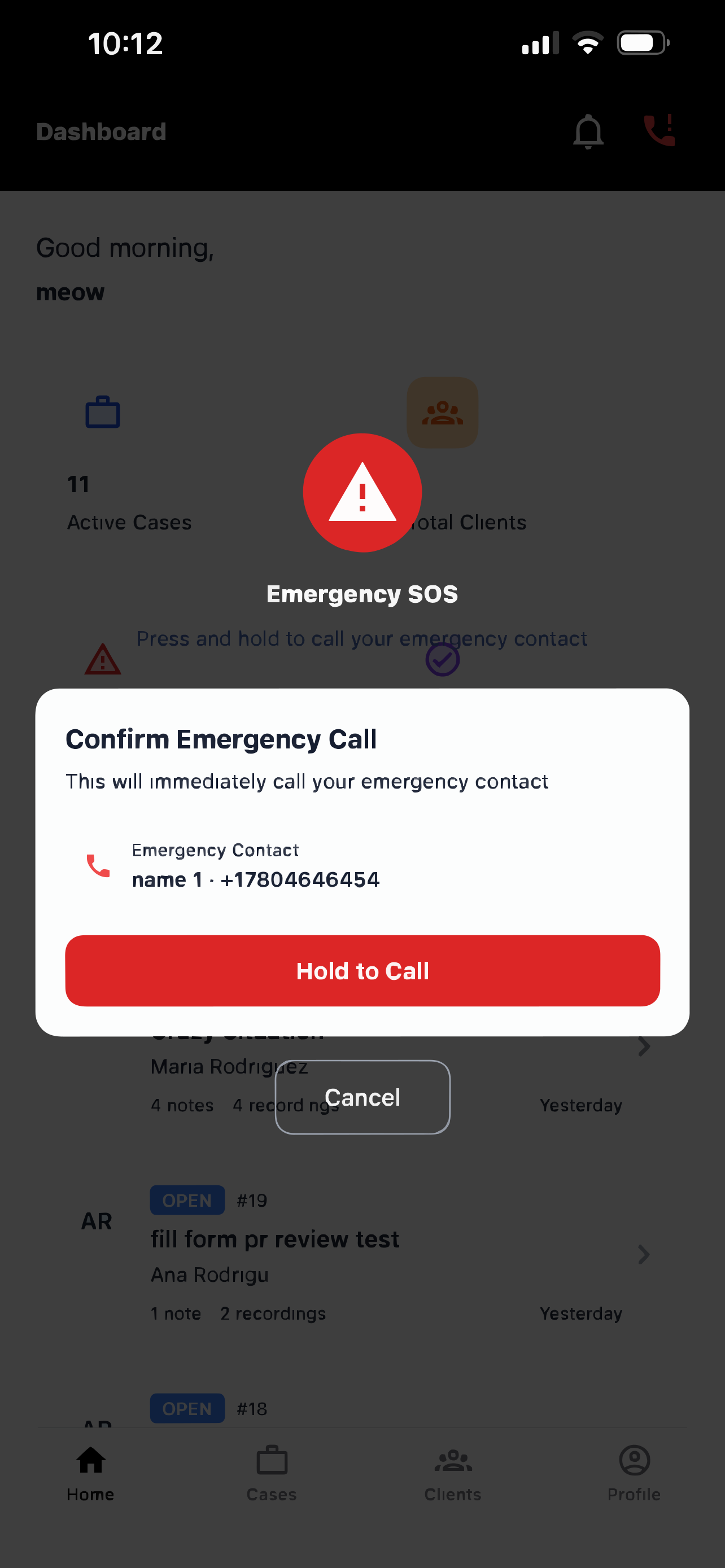
- "Emergency SOS" - Instead of "Emergency Protocol Activation," we use "SOS" which everyone recognizes
- "Cases" and "Clients" - We use real-world social work terms that practitioners already know, not database or system language
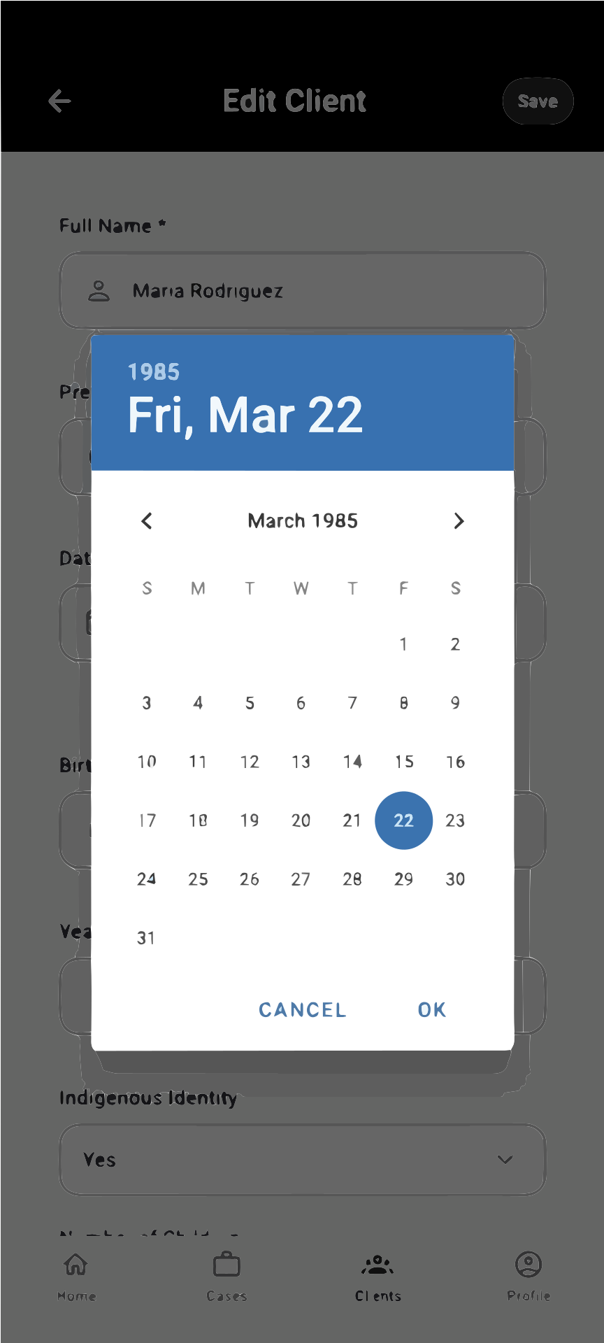
- Calendar-style date pickers - When selecting appointment dates, users see a familiar calendar interface
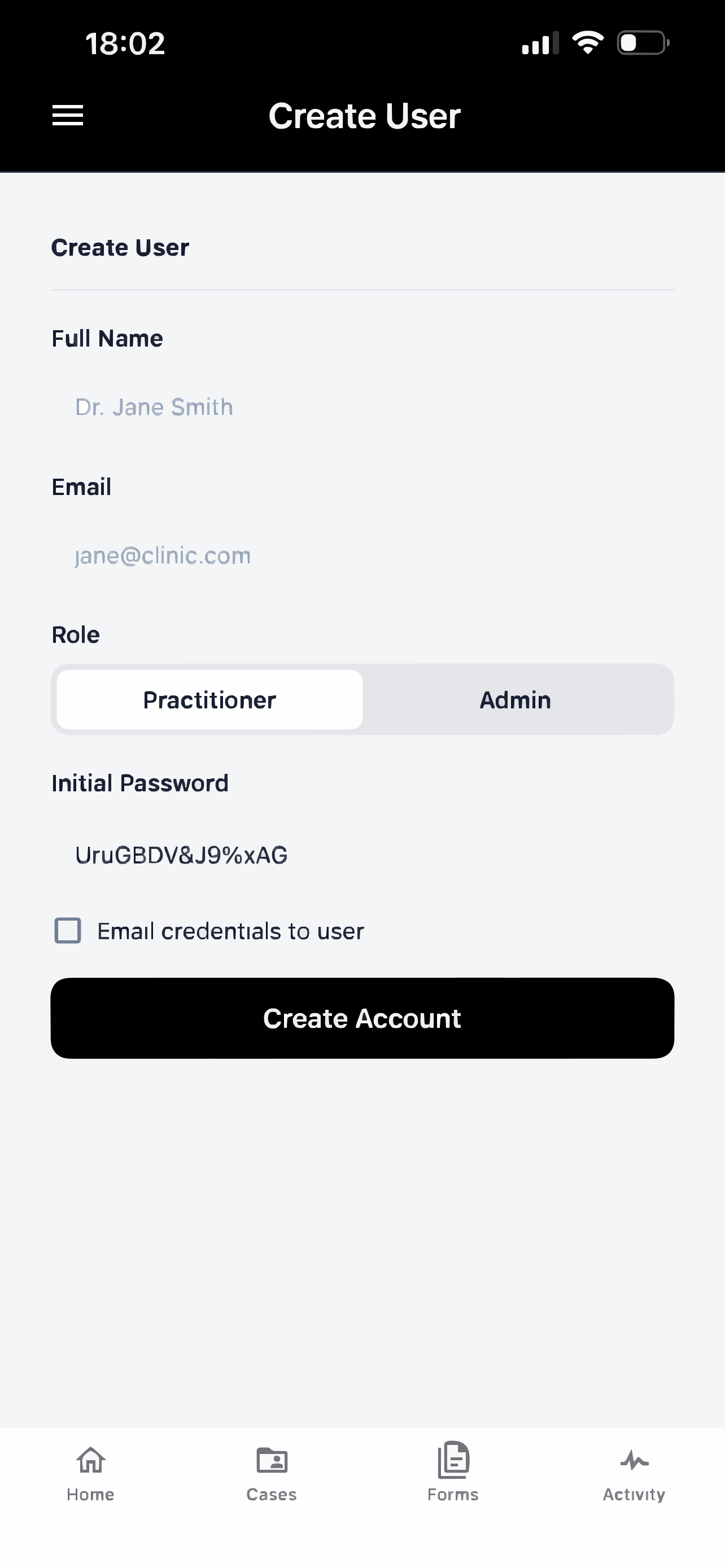
- "Practitioner" and "Admin" roles - Clear role names that match real job titles, not "User Type A" or "Permission Level 2"
- "Recording" and "Playback" - Simple audio terms instead of technical phrases like "Audio Capture" or "Media Player Instance"
3. User Control and Freedom
What it means: Give users a way to undo actions or exit processes easily.
Examples in our app:
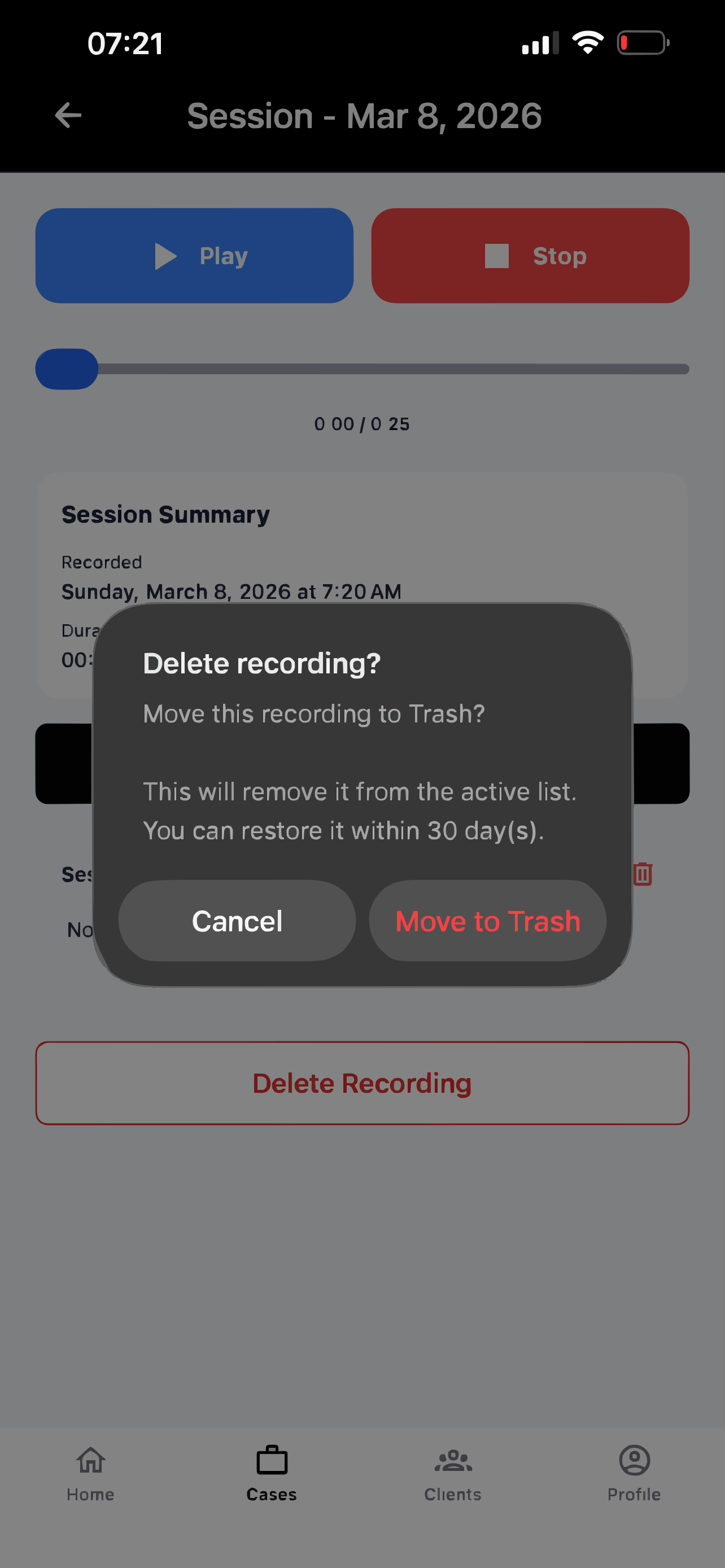
- Delete recording - Practitioners can delete recordings they don't want to keep, with a confirmation prompt to prevent accidents
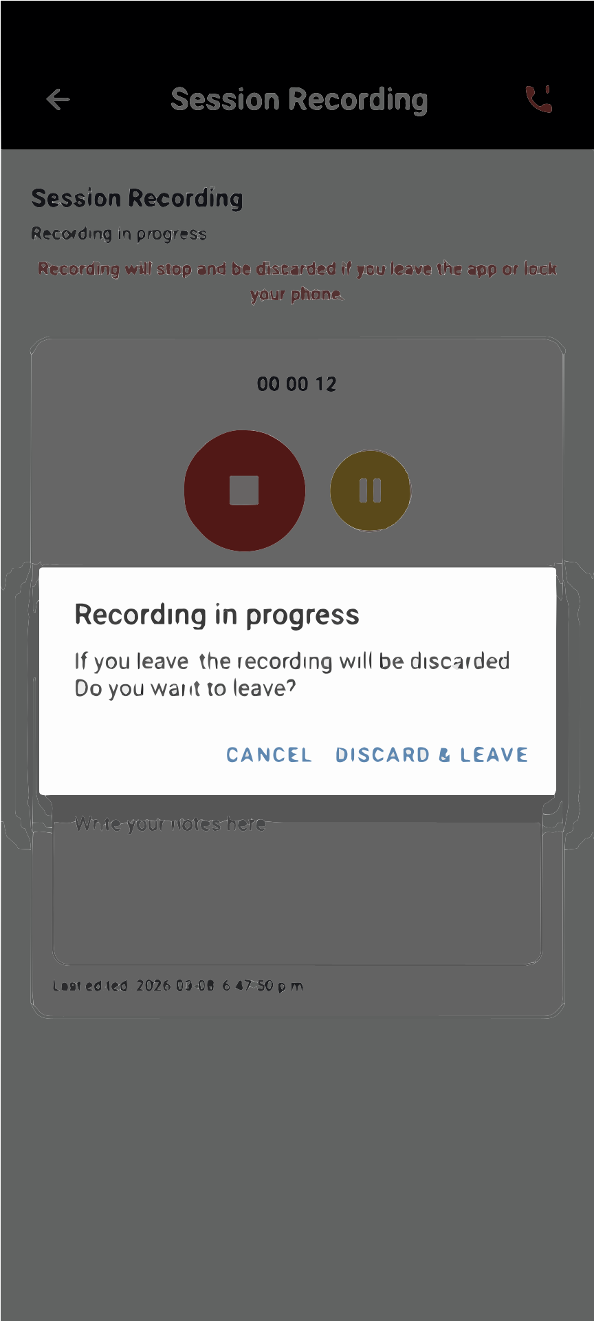
- Exit recording confirmation - When clicking back during recording, a popup asks "Recording in progress. If you leave, recording will be discarded. Do you want to leave?" giving users control to cancel or proceed Recording Exit Warning
- Edit session notes - Users can go back and edit notes they already created
- Undo client edits - Users can cancel editing client information by clicking the back arrow icon, discarding any unsaved changes
- Pause/Resume recording - Practitioners can pause recordings during sensitive conversations and resume when ready
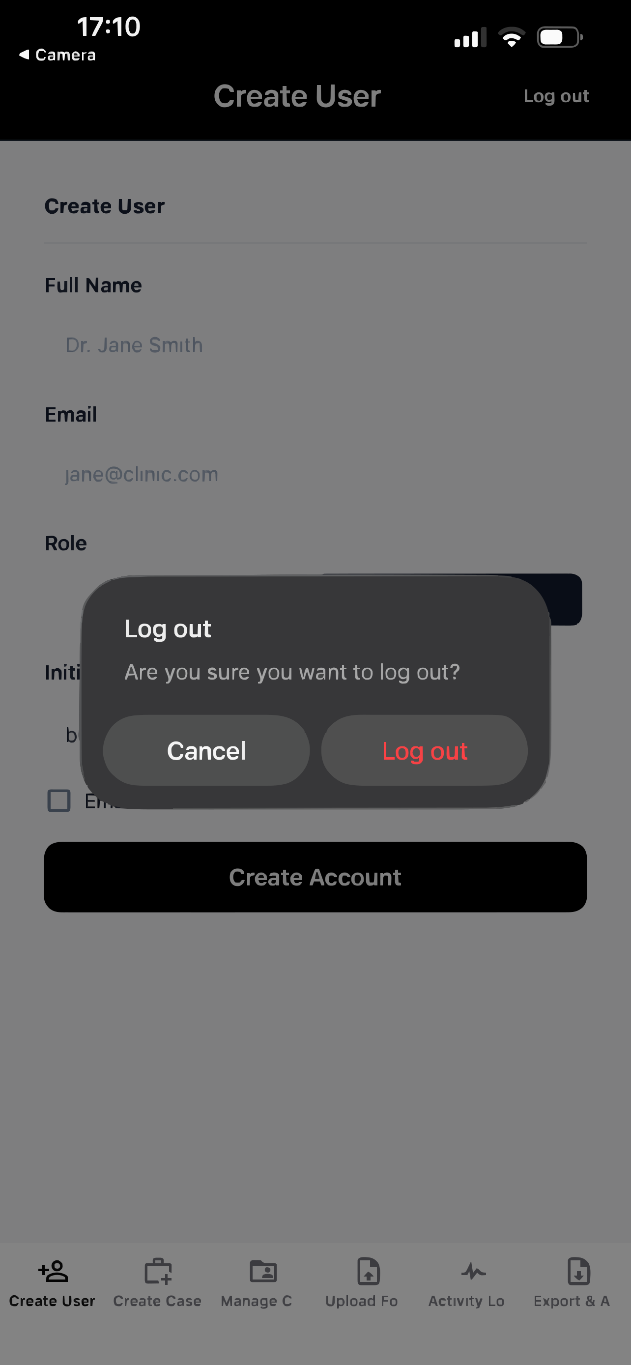
- Logout option - Users can easily sign out when they want to exit their account or switch to another account
4. Consistency and Standards
What it means: Keep things looking and working the same throughout the app.
Examples in our app:
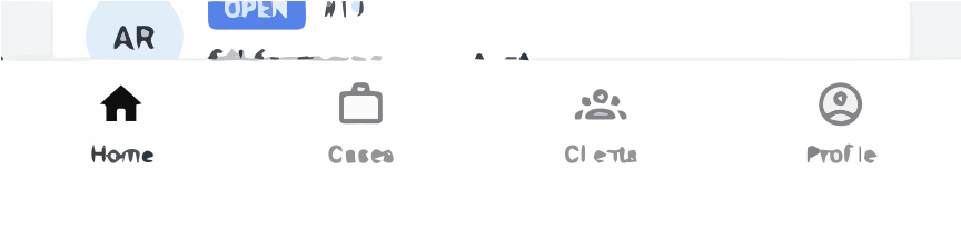
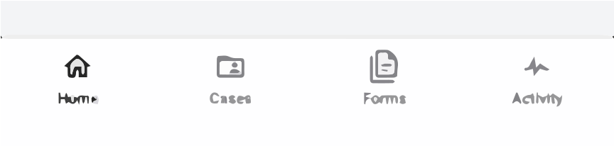
- Navigation bar - The bottom navigation stays in the same place on every screen (Home, Cases, Clients, Profile)
- Button colors - Primary action buttons are always the same color and size
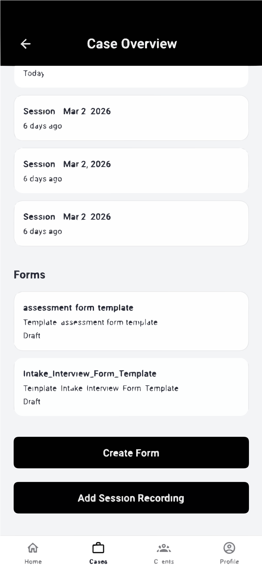
- Form layout - All forms follow the same pattern: label on top, input field below, submit button at the bottom
- Tab structure - Both admin and practitioner views use the same tab navigation pattern
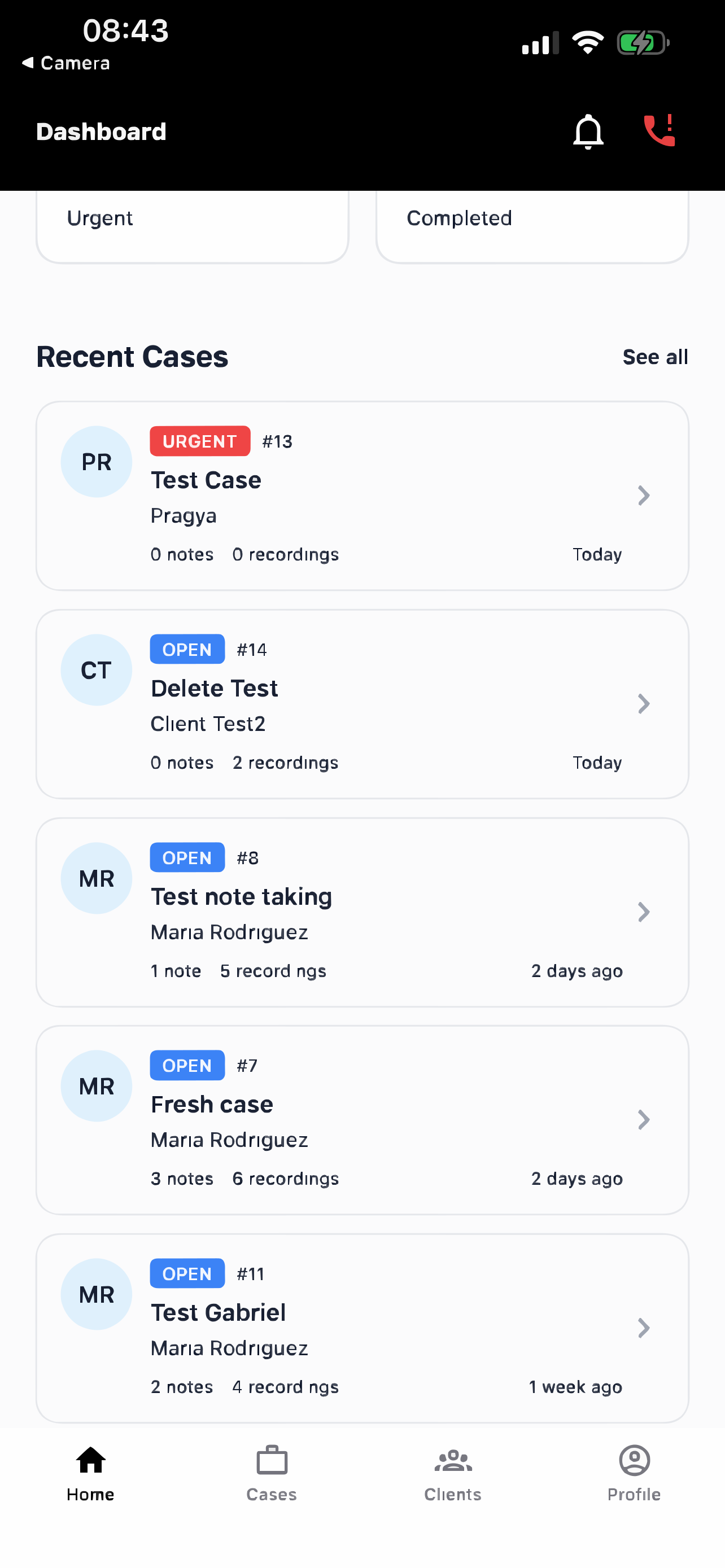
- Card design - Client and case information always appears in consistent card layouts with the same spacing and fonts
5. Error Prevention
What it means: Stop errors before they happen, rather than just showing error messages after.
Examples in our app:
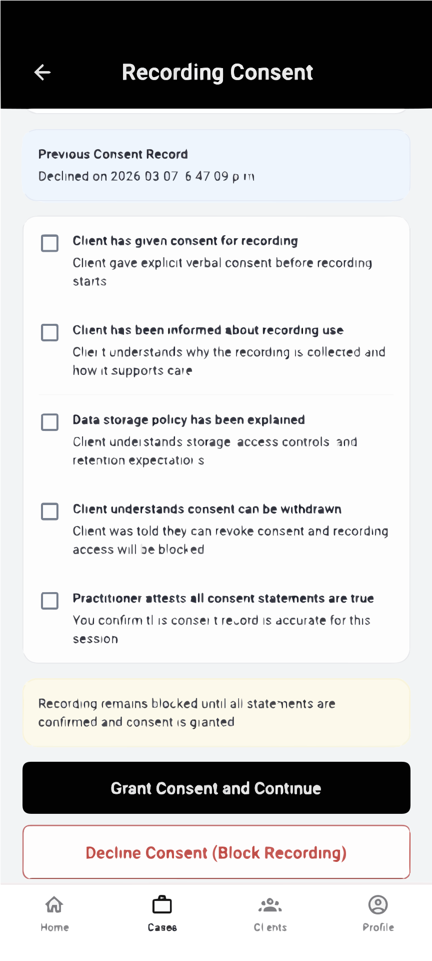
- Recording consent check - Before recording starts, the app requires practitioners to confirm client consent was obtained
- Recording loss warning - Red text warns users that "recording will stop and be discarded if you leave the app or lock your phone" preventing accidental data loss
- Exit recording confirmation - If users try to navigate away during recording, a popup confirms they want to leave and lose the recording Recording Exit Warning
- Required field indicators - Forms show asterisks (*) on required fields so users know what must be filled
- Delete confirmation - Before deleting important data like recordings or cases, users must confirm their choice
- Date validation - Calendar pickers only allow selecting valid dates, preventing users from entering impossible dates
6. Recognition Rather than Recall
What it means: Show users what they need instead of making them remember information.
Examples in our app:
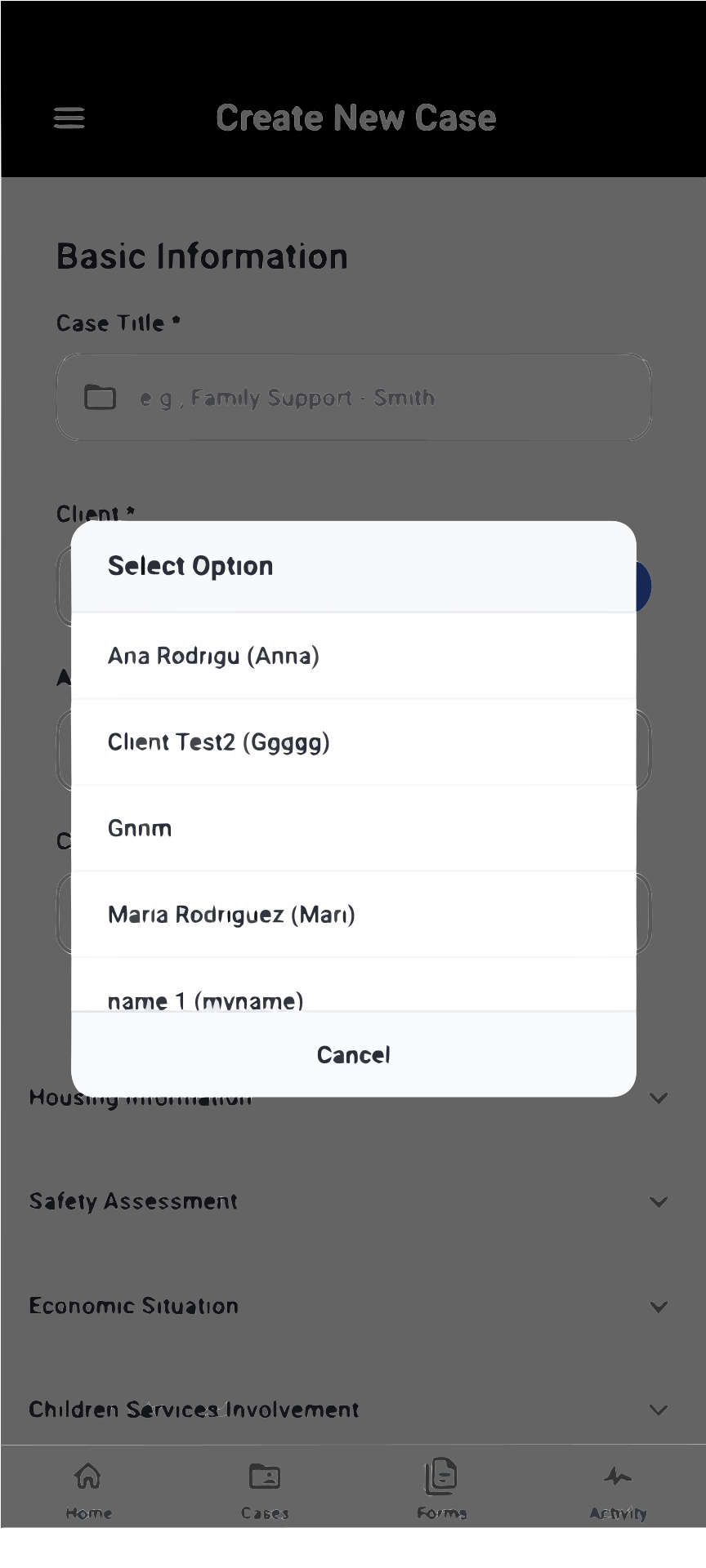
- Client dropdown with names - When creating a case, admins see a list of client names to choose from, not client ID numbers they'd need to remember
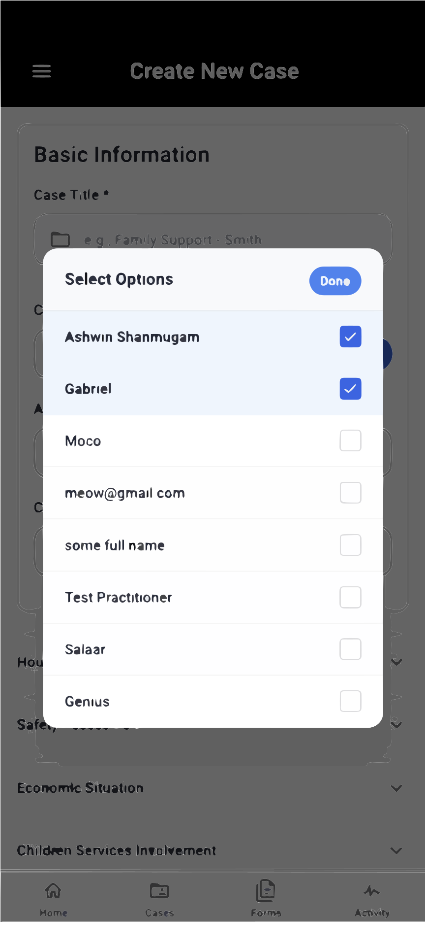
- Practitioner selection list - When assigning practitioners, admins see names and roles displayed clearly
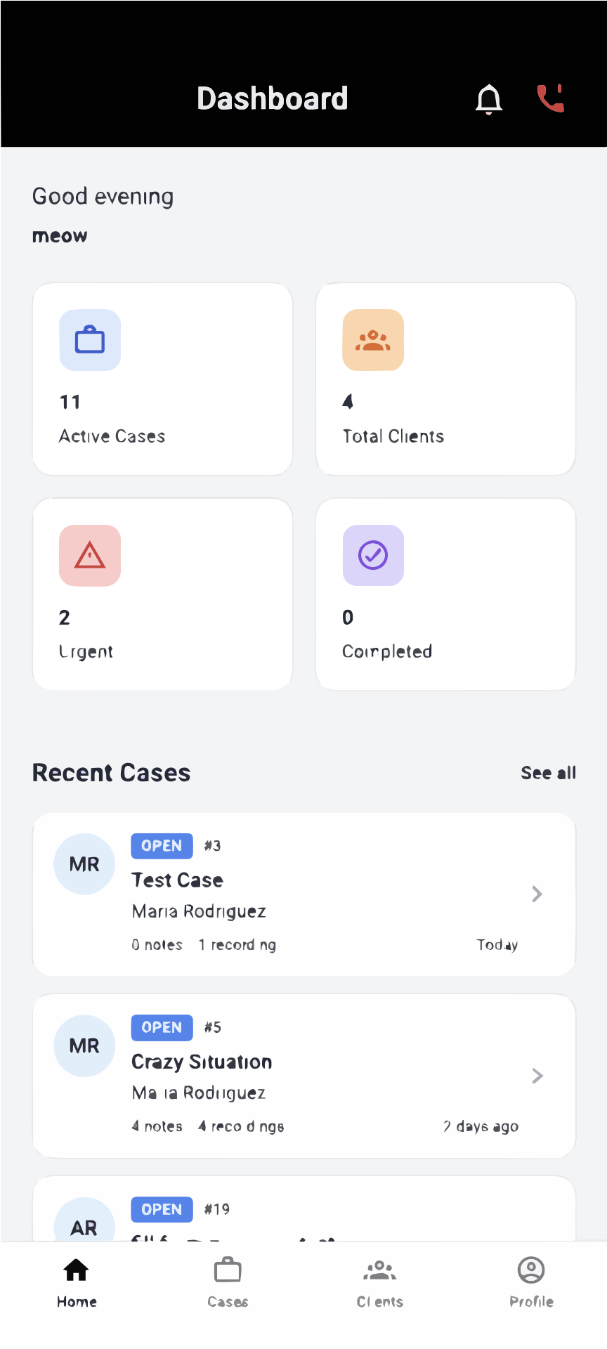
- Recent cases displayed - The home dashboard shows recent cases so practitioners don't need to remember case numbers
- Visual icons - Navigation uses recognizable icons (house for Home, folder for Cases) alongside text labels
7. Flexibility and Efficiency of Use
What it means: Provide shortcuts for experienced users while keeping the app simple for beginners.
Examples in our app:
- Quick access dashboard - Experienced practitioners can jump directly to cases from the home dashboard
- Form templates - Practitioners can save and reuse common form templates instead of filling them from scratch
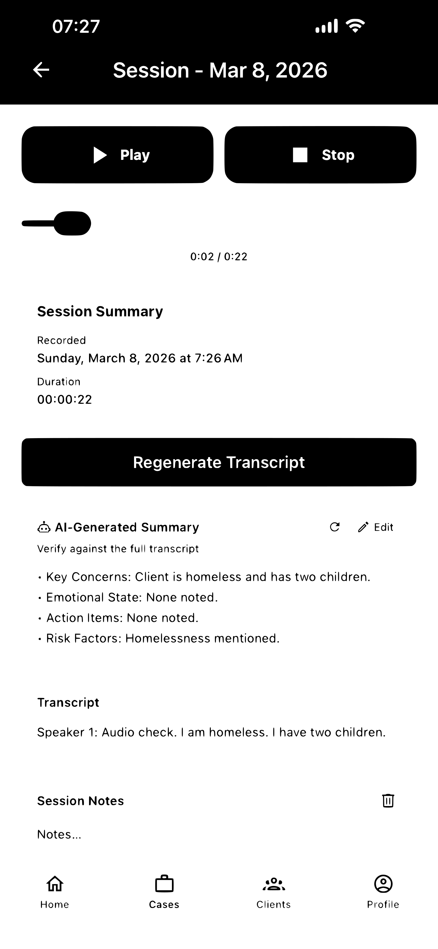
- Generate summary - Instead of manually writing summaries, users can auto-generate interview summaries from recordings
- Bulk actions - Admins can assign multiple practitioners to cases at once instead of one-by-one
8. Aesthetic and Minimalist Design
What it means: Keep screens focused on what matters, removing unnecessary clutter.
Examples in our app:
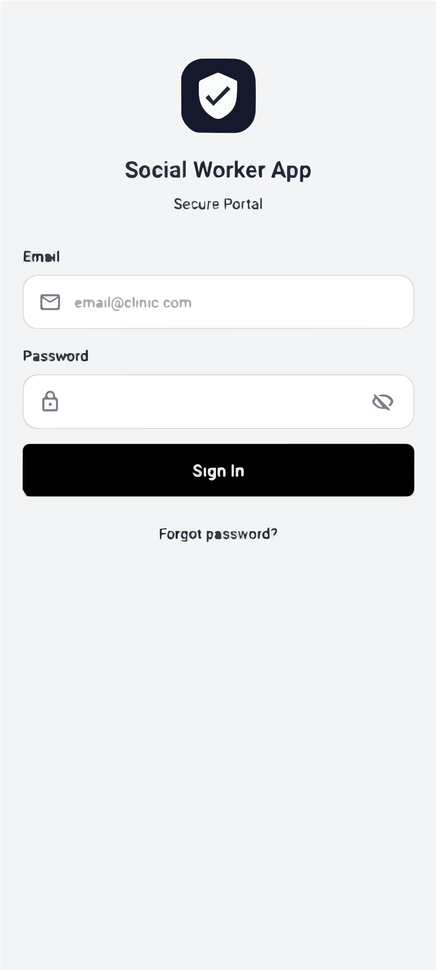
- Clean login screen - Only shows username, password, and login button - no distracting elements
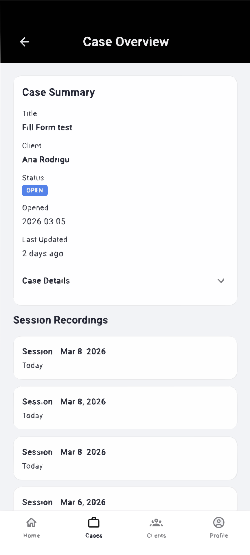
- Case overview cards - Display only essential information (client name, status, date) without overwhelming details
- Single-purpose screens - Recording screen focuses only on recording controls, not mixing in unrelated features
- Appropriate white space - Forms have breathing room between fields, making them easy to read
- Limited color palette - Uses just a few consistent colors rather than many competing colors
9. Help Users Recognize, Diagnose, and Recover from Errors
What it means: Show clear, helpful error messages that explain the problem and how to fix it.
Examples in our app:
- Login errors - "Invalid email or password" explains what went wrong rather than generic "Authentication failed"
- Form validation - "Title must be at least 3 characters" tells users the exact requirement instead of just "Invalid title"
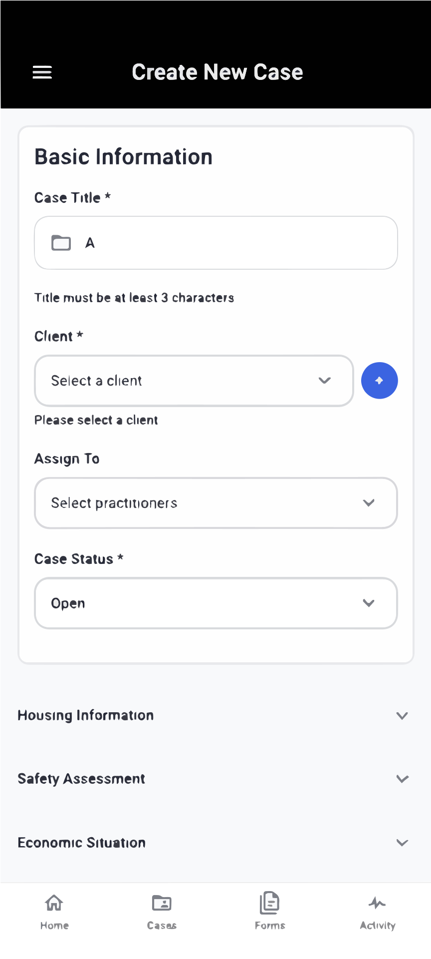
- Missing fields - "Please select a client" highlights the specific problem rather than a generic "Form incomplete" message
- Email validation - "Please enter a valid email address" catches formatting errors before submission
10. Help and Documentation
What it means: Provide help when users need it, in context and easy to find.
Examples in our app:
- Placeholder text - Input fields show examples like "Family Support" to guide users on what to enter
- Recording consent redirect - If users haven't obtained consent, they're automatically redirected to the consent screen with clear instructions
- Field labels - Every form field has a clear label explaining what information is needed
- Background recording warning - Red warning text explains "Recording will stop and be discarded if you leave the app or lock your phone" Recording Exit Warning
Accessibility
Our app is designed to be usable by everyone, including people with visual impairments who use screen readers or require high-contrast displays.
Key accessibility features:
- WCAG 2.1 Level AA Compliant - Our app meets internationally recognized accessibility standards for color contrast, readability, and screen reader compatibility
- Readable Text - All text has strong contrast against backgrounds, making it easy to read in any lighting
- Screen Reader Friendly - Every button, form field, and navigation element has clear labels that screen readers can announce
- Consistent Layout - Logical page structure helps users navigate predictably, whether using touch or assistive technology
- Clear Labels - All interactive elements have descriptive names so users know what each button or field does
For detailed color contrast results and accessibility test summaries, see our UX, UI and Accessibility Report.
Summary
Our FieldNotes AI App implements all 10 usability heuristics to ensure practitioners and administrators can work efficiently and confidently. By following these principles, we've created an intuitive interface that reduces training time, prevents errors, and helps social workers focus on what matters most - supporting their clients.